Panicbudgie is a South African emergency response subscription. Press a button (app, hardware, or voice) and a real responder is dispatched in under 40 seconds. The existing live site didn't reflect the product: default Material UI, mismatched colours, no brand direction. I rebuilt it from scratch as sole designer and developer.
The brand strategy is called 'Daylight, Not Alarm.' Every competitor in South African emergency response uses fear-driven red-and-black branding. Panicbudgie does the opposite: warm daylight yellow as the dominant surface, confidence over anxiety. The aesthetic references are Lemonade, Headspace, and Stripe.
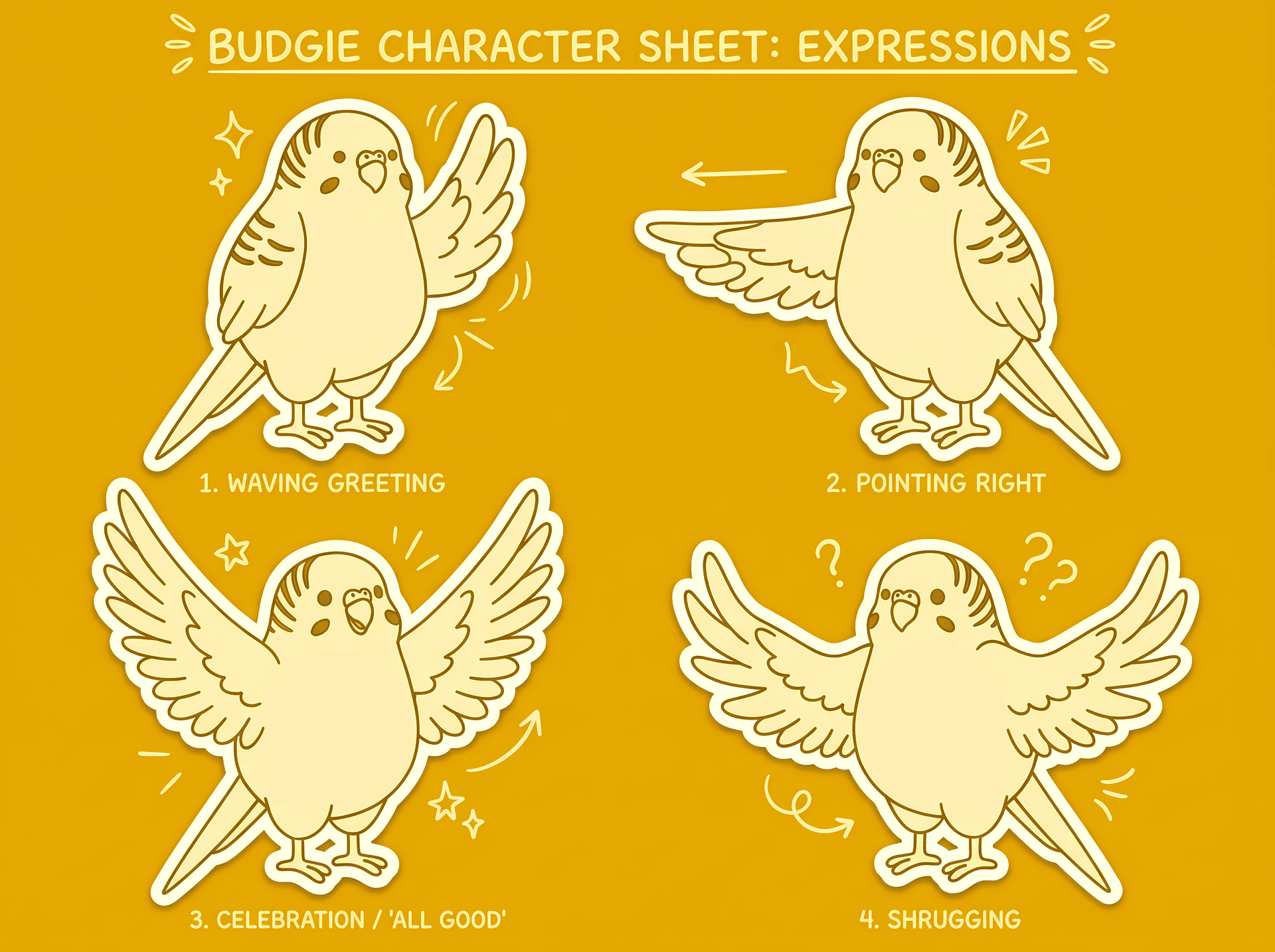
The mascot is Bandit, a budgerigar character used across every section of the site. Consistent AI character generation requires staged reference gating: style reference first, then a canonical orthographic sheet, then pose family sheets, then final assets. Each stage locks identity before the next begins. Every prompt is multimodal-first: references carry the character identity, text only describes what is new in the scene.
The most technically substantial piece is the network section: a live D3.js visualisation showing 27,000+ responders and 9,500+ vehicles across South Africa. Force edge bundling across the full city graph, roughly 2,000 animated pulse dots riding the bundled paths, satellite clusters validated against the actual SA polygon using d3.geoContains. The entire D3 dependency chain (about 130KB) lazy-loads only when the section enters the viewport.
Built in vanilla HTML/CSS/JS. No framework, no component hydration overhead. Performance decisions are explicit throughout: critical CSS inlined, content-visibility on below-fold sections, WebP with PNG fallback on every image, D3 held out of the initial parse. Every line of copy is mine.