Why Designers Should Prototype With Real Data (and how AI makes it practical)
If you're prototyping with made-up data, you're hiding problems from yourself.
This isn't controversial. It's just something most product workflows still tolerate because up until now, this was the only way to work. Design in Figma with placeholder values, get sign-off, hand off to engineering, and only see real data weeks later, once the developer has created the required endpoint. If you're lucky, the developer might notice some issues, flag it, and circle back to you. That would only occur if they happen to load data that surfaces a problem, and they actually notice it. Then you have to update your Figma designs to accommodate this new unknown edge case, and this could happen multiple times, pushing out your delivery time by weeks.
This is a breakdown of a recent project where working with real data from the start fundamentally changed the outcome, and where AI-assisted development made that approach practical within a timeline that would otherwise be unrealistic.
The work started with a product discovery phase: defining what lenders were trying to do, where they were losing time, and which decisions the interface needed to support first.
AI-assisted development tools like Claude Code have made it possible for designers to connect to live APIs, build working prototypes, and iterate on real data without waiting for engineering, which changes the economics of when and how you discover these problems.
The project
On NFTfi, a peer-to-peer NFT lending protocol, lenders had a consistent problem: they had capital to deploy, but no clear way to assess whether their loan offers were competitive. The market moves quickly, collection values shift, and the only reference point available was a table of existing offers.
Tables are useful for storage. They're not useful for understanding the loan offer landscape.
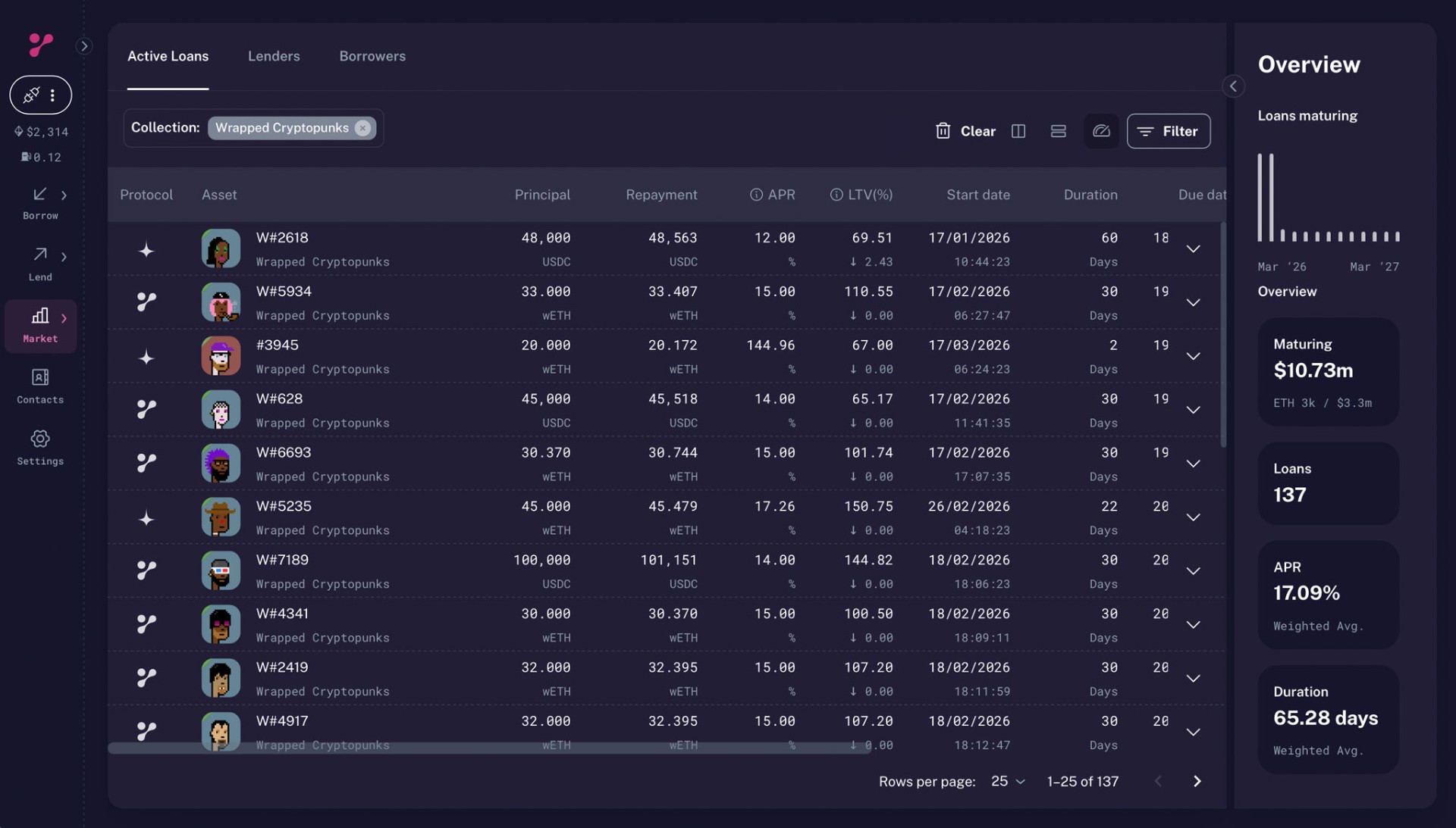
After speaking with lenders, I sat with them and observed how they were pricing offers roughly ten times a day. The real problem was speed: they needed to see where an offer sat relative to the market immediately, without scanning rows manually.
So I built an interactive scatterplot using React, TypeScript, and D3. It visualised existing loans and allowed users to position their own offer within the distribution.
The full build, from first commit to deployed beta, with multiple iterations and user testing sessions, took five days. That timeline only makes sense if you factor in AI-assisted development. I used Claude Code to handle implementation while focusing on product decisions.
The problem with fake data
The issue with placeholder data isn't just that it's inaccurate. It actively interferes with feedback.
If you show a prototype to users who work with real numbers (traders, lenders, analysts), they don't ignore bad data. They fixate on it.
"how could you earn that much interest off such a low APR?"
"No one would offer 45 ETH for a Subscapes in this market."
At that point, you've lost the conversation. Instead of evaluating the tool, they're reacting to the data. You're defending a prototype, explaining that you just estimated the data, completely derailing the testing, instead of learning from it. This can happen even if your data is broadly accurate, but off by a few percentage points.
Connecting to real data from the start removed that problem entirely. Users were looking at their own market, not a fabricated sample. Feedback was immediate and relevant.
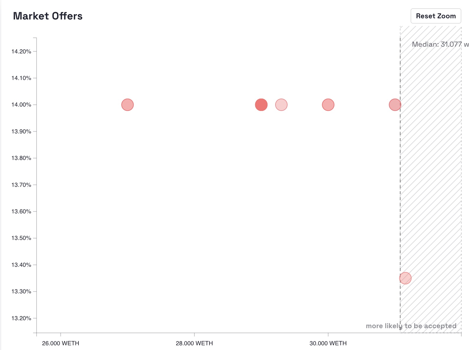
Discovery #1: Overlapping data that distorts reality
With real data, the first issue was obvious.
Multiple loan offers often exist at identical coordinates: same amount, same APR. This happens with collection-wide offers, where a single offer applies across multiple NFTs.
In a mockup, you'd distribute points evenly, or at least in a way that you imagine the data would look like, you might even fudge things to make your design look better.
In reality, you get stacked points sitting on top of each other. Visually, they appear as one. Statistically, they represent concentration.
That concentration matters, it shows the lender how many loans are available at a particular APR and price, and it also affects median calculations.
Without real data, you don't see it. With real data, you can't ignore it.
The solution was to introduce a density heatmap: something that communicates not just where offers exist, but where they cluster. In addition to this, I also showed the user the number of loans at a specific spot via a tooltip.
Discovery #2: Outliers that break the interface
The second issue was more severe.
Most NFTs in a collection sit within a narrow value range. But rare items (specific traits, unique attributes) can be worth multiples of the floor price, when one of these appeared in the dataset, it broke the chart.
A single loan at an extreme value would compress everything else into an unreadable line near zero. The visualisation became useless.
This doesn't show up in mock data. You'd never design for it, but with real data, it's unavoidable.
The fix was to constrain the visible domain using the IQR method (Tukey's fences), filtering outliers from the chart while still acknowledging their existence in the dataset.
I didn't know this method beforehand. I described the problem and used AI to identify an appropriate statistical approach, then validated and implemented it, another practical role of AI here: it closes gaps in domain knowledge without slowing down the process.
Market Offers
Why AI changed the timeline
Five days, 42 commits, and a working product:
- Interactive scatterplot
- Drag-based positioning
- Density heatmaps
- Outlier handling
- Currency conversion
- Filtering
- Responsive layout
This isn't about AI "writing code." An experienced developer could build this. The difference is that I'm not primarily a developer.
Without AI, this becomes a trade-off: either spend significant time implementing it yourself, or write a spec and wait for someone else to build it, but with AI, that trade-off disappears.
When something broke, I didn't need to dig through documentation for hours. I could describe the issue, evaluate solutions, and move forward. When I needed a statistical method, I didn't need prior knowledge; I needed a clear description of the problem.
The bottleneck shifts from implementation to decision-making, which is where it should be.
The feedback loop
The real advantage of this approach is speed of iteration. Over five days, I was showing working versions to active lenders and getting feedback in real time. When something didn't work, it could be adjusted within hours. When something did work, we knew immediately. That feedback loop is the entire point.
Traditional workflows delay this until after engineering time has already been committed. At that stage, changes are expensive. This is why working with real data and AI-assisted implementation moves discovery earlier, when changes are cheap.
What shipped
The tool was deployed and tested by real users.
It allowed lenders to assess the market visually and position offers with more confidence. That directly improves participation and liquidity on the platform.
More importantly, every meaningful feature in the final product came from something real data exposed:
- Density visualisation → overlapping offers
- Outlier handling → rare items distorting the chart
None of these would have emerged from a prototype built on sample data.
Practical takeaways
Connect to real data as early as possible. If it makes your prototype messy, that's useful. The mess is where the insight is.
AI doesn't replace engineering. It removes implementation friction so you can focus on decisions that matter.
Show working software to users. Feedback on a real system is fundamentally different from feedback on a mockup.
Use AI to fill knowledge gaps, but validate what you implement. The goal isn't to outsource thinking; it's to accelerate it.
The standard design → spec → dev process isn't wrong. It's just inefficient for discovery. Once you know what works, you can build it properly.
Interactive prototype
The chart below is a working version of the tool described above. With data snapshotted in March 2026.
Your Offer
Market Offers
Stack: React, TypeScript, D3.js, Claude Code (AI-assisted development), Cloudflare Workers, Tinybird (data API)