When linear and log both fail: building an adaptive D3 scale
A data-visualisation scale that didn't exist, built part-time in a week, and what that says about design engineering with AI.
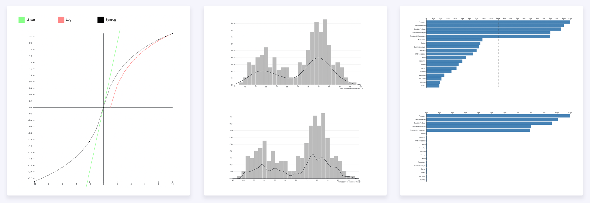
Most chart libraries assume your data is reasonably evenly spread. A lot of real data isn't, and financial data least of all: it tends to bunch into a narrow band and then throw extreme outliers out to one side or both. The two usual scales, linear and logarithmic, both struggle with that, in opposite ways.
I ran into this at NFTfi and ended up building a scale for it: linear through the dense middle of the data, logarithmic in each tail, with the cut-off points worked out from the data itself. As far as I can tell, nothing like it existed in D3. I built it with AI assistance over about a week of part-time work, around four other projects.
That last part, the week of part-time work, is really what the article is about. The research, the maths and the implementation that a project like this used to require have all become much cheaper to do. That doesn't make designers and engineers redundant; it raises what one person is expected to be able to build. What follows is how the scale got built, dead ends included, and what each step says about that change.
The dashboard it was for showed lenders the whole NFT lending market in one view, our own loans alongside Arcade, Blur Blend and Gondi. NFT loans cluster around a typical size, about $62K for CryptoPunks in 2024, but the range runs from a thousand or two, sometimes lent against a punk worth a hundred times that, up to a single $2.75M loan. That spread is the problem in concrete form.
On a linear scale the small loans collapse into a line at the bottom and the seven-figure deals take the rest of the axis, so the band most of the activity sits in is unreadable.
A log scale fails the other way. It spends space by ratio, so the step from $1K to $10K gets as much room as the step from $100K to $1M. The sparse low end ends up with about a quarter of the axis while the dense band is squeezed into a tenth of it, and no part of a log axis reads in plain dollars.
With outliers on both sides, no single transform works: compressing one tail distorts the other, and the band in the middle suffers either way. What does work is a scale that changes behaviour by region, linear through the dense middle where you want to read precise values, and logarithmic in each tail where the range is too large for that. The breakpoints, where the middle ends and each tail begins, are worked out from the distribution rather than set by hand.
Research before the first line of code
My rule for anything non-trivial is to understand the whole solution space before committing to one approach. I used Claude to catalogue 21 visualisation techniques across four families: scale transforms like log, symlog and piecewise; visual encodings like broken axes, violin plots and ECDFs; interaction patterns like focus-plus-context and linked brushing; and layout approaches like small multiples. Each one got weighed against the same two-sided, outlier-heavy distribution.
I also read what the literature says about outlier-heavy distributions: Tufte, Cleveland, Wilkinson and Heer. Cleveland is blunt about it. Try a log scale first, and if that fails reach for small multiples rather than a broken axis, which he's openly sceptical of.
The research was AI-assisted, and it's worth being honest that this is also where a couple of errors crept in. The first pass was a direct conversation with Claude — a quick catalogue where I asked it to map each technique to its D3 method. A few of those methods don't exist. It offered d3.density() and d3.kde() for violin plots, when D3 has neither and kernel density has to be hand-rolled, and d3.facet() for small multiples, which belongs to Observable Plot — a separate, higher-level charting library by the same author — and has no equivalent in core D3. The second pass used Claude Code's structured /research tool, which ran a deeper per-technique sweep and caught both errors before any of it reached code. AI-assisted research is faster, but the first pass still has to be verified against the real documentation.
I looked at the existing community attempts too. The d3-scale-break plugin has four GitHub stars and was last touched in early 2023, so it's effectively unmaintained. d3fc's discontinuous scale removes gaps but doesn't change the transform per segment. Bostock's archived d3-fisheye does continuous distortion, not the structured regions I was after. The conclusion held up: a three-region log-linear-log scale with data-driven breakpoints was a genuine gap, not a solved problem I'd overlooked.
"[research] Chose to research 21 techniques across four categories before committing to any implementation."— DEVLOG.md, session start
The spec came before the code
Before any implementation, the maths came first — not because I sat down with a notebook, but because that is how D3 is structured. A scale is pure functions, entirely separate from any rendering, and designing a custom one means defining what it must guarantee before any code exists to do it. Working through the algebra with AI is faster than working through it alone; the tedious parts are genuinely tedious and AI handles those well. The part that still requires judgment is deciding what the invariants should be in the first place.
A scale this custom has three properties it can't break. The first is that it stays monotonic: a bigger loan always has to sit further along the axis than a smaller one. That sounds obvious, but a scale stitched together from three pieces can accidentally fold back on itself and plot a $2M loan to the left of a $50K one, which isn't really a rendering glitch so much as a false statement about the data, so the maths has to rule it out everywhere.
The second is that it's invertible: you can run it backwards, from a pixel position to a dollar value. That's what lets the chart answer "which loan is under my cursor?" for a tooltip, and "what range did I just drag a box around?" for a selection. The third is that it's continuous at the seams, since the three regions meet at two points, and a loan sitting exactly on a seam has to land on the same pixel whether you measure it from the region on its left or the one on its right, or the dots visibly jump at the join. None of these are nice-to-haves. Break any one and D3's axis rendering breaks with it.
So I worked the proofs with Claude. Each region is monotonic on its own, the three are laid end to end without overlapping so the whole scale is too, and lining them up at the seams is a few lines of algebra.
Then the breakpoints, which is the question of where the dense middle stops and an outlier tail begins. I used the standard statistics rule for this, the same one that draws the whiskers on a box plot, so the cut-off comes from the data rather than a number I picked. You take the middle half of the loans, the range from the 25th to the 75th percentile, measure how wide that band is, and step out one and a half of those widths from each end. Anything past that point counts as an outlier and goes into a log tail, and everything inside stays linear. If one side has no outliers, that tail simply isn't drawn and the scale becomes two regions; if neither side does, it's a plain straight line. There's nothing to configure.

Then the scale contract, the exact interface D3's axis component expects:
scale(value)           → pixel position
scale.invert(pixel)    → domain value (for tooltips, brushing)
scale.domain([lo, hi]) → getter/setter
scale.range([lo, hi])  → getter/setter
scale.ticks(count)     → tick values respecting region boundaries
scale.tickFormat()     → tick label formatting
scale.copy()           → independent clone
In D3 a scale is pure maths, a function from a data value to a pixel position, and the chart renders on top. Keeping those two as separate concerns is the convention, not my invention, and I used AI to research exactly what that interface looks like before asking for any code. That's a habit worth developing: left without clear direction, AI will build something that works but sidesteps the framework rather than slotting into it. Getting it to research the library's own patterns first, and then match those exactly, is the way to avoid that.
I wrote all of this down before asking for any implementation. The setup prompt was specific: here's the interface, here are the rules it can never break, here's how I want it tested. I asked Claude to build two things before any real logic: first the empty function shells that match the interface but do nothing yet, so the shape of the scale was fixed before the maths went in, and then an automated test suite — a set of checks that runs the scale against thousands of values and fails loudly the moment a rule breaks. With the shells and the checks in place, correctness was measurable from the very first line of real code.
The test suite did double duty. It wasn't only how I checked the work — it was how the AI checked itself: with the rules written as runnable tests, it could make a change, run them, and know immediately whether it had broken anything. This is worth being concrete about, because it's where a lot of AI-assisted work bogs down. If every change has to come back to you to check by eye, you are the bottleneck. If "correct" is written down as tests the model can run, it can iterate on its own and only surface things it genuinely can't settle.
That was the collaboration model throughout: the spec was mine, the acceleration was the AI's.
How I used AI on this project
There's a version of "AI-assisted development" where you describe what you want in loose terms and accept whatever comes back. That isn't what happened here. I gave Claude a project-level CLAUDE.md, a specification baked into the repository that set the quality bar. Part of it read:
"This code will be submitted to Observable. That sets the quality bar. Observable is the canonical home for D3 work — Mike Bostock reads submissions. Every idiom, every pattern, every line of chart code must be the way the D3 community would write it, not a workable approximation."
(Observable is the web notebook platform built by Mike Bostock, the creator of D3. It's where the D3 community publishes and critiques work, so code submitted there gets read by the people who set the conventions.)
The rest of the file was concrete constraints. Some were about idiom: use viewBox and CSS sizing instead of fixed SVG dimensions, use D3's join pattern with proper enter, update and exit rather than clearing and redrawing, and use pointer() rather than the d3.mouse() that was removed in v6. One was about Observable's specific environment: give every chart instance a unique clipPath id, because Observable renders many cells at once and a shared id silently breaks clipping across all of them. And one was architectural: keep the scale layer free of any DOM knowledge, pure maths that's testable without a browser.
I also kept a DEVLOG running throughout, timestamped one-liners capturing each decision, dead end and surprise as it happened, rather than a tidy retrospective written afterwards. The discipline of logging forced me to say why a choice was made at the moment I made it. One entry records a judgment call the AI couldn't have made for me:
"[10:54] Pre-Observable review: kept the modern options-object chart factory over converting to the 2012 'Towards Reusable Charts' getter/setter closure pattern — the closure idiom is superseded in current Observable / d3-gallery notebooks, so converting would move away from the Bostock-review bar."
I had to know which of two valid D3 patterns was the current one, and this points to a specific way AI can lead you astray. It doesn't weigh up which idiom is in favour now; it reproduces whatever was most common in what it trained on. In D3 the most cited chart pattern by a wide margin is Bostock's 2012 "Towards Reusable Charts" closure convention, and because it's so heavily referenced, an AI tends to reach for it by default, especially when you ask for something "publishable". It's a decade old, though, and largely superseded in current Observable and d3-gallery notebooks. Left unwatched, an AI will happily move working modern code towards the older, more-cited idiom because frequency, not currency, is what it's really keying off. Knowing the convention had moved on, and steering away from it, was the part I had to bring.
The development process
The git log runs to 88 commits across about a week, and it doesn't tell a clean story. That is normal for work like this, and the mess is the point: with AI, trying an approach and abandoning it costs very little, so you try more of them, and what you ship is better for the paths you could afford to explore and reject.
The log scale that kept collapsing. Dragging the linear window to the data boundary on extreme-range datasets made the log scale collapse, with pixel positions blowing up exponentially. I fixed it, then fixed it again; five commits, all with the same title, before the fifth one actually held. When you find yourself in a loop like that — trying the same fix in slightly different forms and none of them holding — it's usually time to change approach rather than try again. Clear the context window, re-explain the problem from scratch, or switch models; the stale accumulated framing is often what's blocking a real solution.
Showing the compression in the tails. Most of one day went on a single sub-problem: once the tails are logarithmic, how do you make the compression legible, so a reader can see the right-hand region is squeezed far harder than the left? I went through several approaches. The one I spent longest on was a diagonal hatch, SVG patterns spaced denser where the scale compressed harder. The idea was sound, but it threw a fresh rendering artefact at every step:
"[11:05] Fixed hatch gap artifact: Chrome Blink clips SVG pattern tile content at tile boundaries even with overflow:visible, causing anti-aliased dots at every tile seam — replaced patterns with explicit full-height line elements per band."
I dropped the hatch by mid-afternoon and replaced it with a plain tail ruler that annotates the compression directly. The evening then went on how to shade that ruler so the squeeze reads at a glance: graduated tints, a dynamic gradient, and a few others, most of which I tried and reverted before settling on simple line density. That is several discarded visualisations of the tail in a single day. In hand-written code it would have been a painful waste; with AI each attempt was a branch I could try and abandon cheaply, and the result was better for having ruled the others out.
The symlog mirror problem. A standing instruction I gave Claude was to prefer standard, canonical D3 wherever it applied. This was the flip side of that. The tuned power-scale tails I'd set up (a scalePow with a 0.3 exponent) got replaced with the more conventional d3.scaleLog, in a commit that bundled the change with some unrelated ruler work and carried no log entry about what the swap did to the tails. I didn't catch it at the time. This is a pattern worth naming: over a long project, a codebase can drift. Accumulated context and a blanket instruction to "prefer canonical D3" combined to produce a silent change I'd have rejected if I'd seen it clearly. It's worth periodically asking the AI to audit its recent work against your original objectives — to read back what it's actually built, not just what you intended. That's how I caught this one.
What I noticed later was the shape of the chart. The two tails are meant to mirror each other around the linear window, compressing the same way as they run outward from it. Instead the left tail's compression was bunched on its inner side, against the window, the opposite of the right. They weren't mirror images. Tracing it led to the entry that turned out to be the real insight of the project:
"[13:50] … scalePow(0.3) was never a mirror either — exponent<1 expands the small end exactly like log. A plain log/pow tail CANNOT mirror its opposite because log measures ratio, which is unbounded going up but floors at zero going down; its slope 1/x always expands the small extreme."
In plainer terms, a logarithm always gives the small end more room, so the left tail stretches outward while the right compresses, and no tuning makes them match. Mirroring needs a different construction: feeding d3.scaleSymlog the distance outward from the window's edge rather than the raw value, because distance is symmetric in a way that value isn't.
That made mirroring possible, but it raised a second question, the symlog constant, and this is where I had to hold the line. Claude's first attempt fixed a single shared constant so the two tails came out pixel-identical, a clean visual mirror. I rejected it, because forcing that symmetry normalises the data away: a tail covering a small range should stay close to linear, not be stretched to match a tail covering a huge one. I pushed back:
"I don't want to massage how that works depending on the data… my ultimate goal is not a visual outcome."
The AI agreed it had been massaging, and the constant was reworked to derive from each tail's own data and geometry. The tails come out symmetric only when the data is symmetric, never because the constant was set to force it.
It's worth saying why this whole episode was expensive. A consequential change, swapping the entire tail algorithm, went in bundled with unrelated work and with nothing in the log explaining it, so it was easy to miss, and I lost real time afterwards debugging what looked like a rendering fault. That is the everyday failure mode of working with AI: it changes more than you asked it to, and it rarely flags the consequences. It will also state things confidently that aren't true, including about what it has just done to your own code, so its account of its work can't be trusted on its own. The only defence is to read the diffs and understand the code it writes, as a standing discipline rather than something you reach for once something already looks wrong.
Switching models to break blind spots. Midway through I ran a refactoring pass with Gemini instead of Claude: two commits, then a dead-code sweep to clean up after it. The interesting part wasn't the refactor, it was the reason I reached for a different model at all. A long AI session gets invested in its own approach. It's carrying all the context of the choices already made, and with that come blind spots, because it can't easily question the assumptions it baked in itself. Two things help. One is a fresh instance with no memory of the session, which has nothing to defend and reads the code cold. The other is a different model entirely, with its own strengths and its own failure modes, so it flags what the first one walked straight past. Gemini's pass needed pruning afterwards, so it wasn't a clean win, but that was never the point. A second vantage point surfaces what the first one can't see, and switching the model is one of the cheapest ways to get one.
The quality bar
By the end there were 68 tests, and they check the four properties I'd specified before any code existed. Monotonicity runs across a thousand evenly-spaced values to confirm every consecutive pair stays in order. Invertibility checks that the round trip from value to pixel and back lands within floating-point tolerance. Boundary continuity confirms the pixel at each seam comes out identical from either neighbouring region. And graceful degradation checks that data with no outliers produces a plain linear scale, and one-sided outliers produce a two-region one.
The D3 idiom standard was enforced rather than aspirational. A pre-publication audit turned up seven specific issues, all caught and fixed:
"[18:47] D3 idiom audit: found 7 issues — removed unused pointer import, switched SVG to viewBox+CSS sizing, replaced container.id-based clipPath ids with an incrementing counter, added ResizeObserver with 120ms debounce, added scale.type='adaptive' to replace duck-type check on breakpointMethod, fixed yPad fallback for small y values."
Because of the DEVLOG, each of those fixes traces back to the decision behind it.
Automated code review
Once the implementation felt complete, I ran a multi-agent code review: ten independent agents reading the full diff from different angles, correctness, removed-behaviour regressions, cross-file tracing, D3-specific pitfalls and convention breaches, with a separate verification pass on each candidate they raised. It surfaced four real bugs that the two of us, me and the AI I'd been pairing with, had missed.
The first was a selector bug. handle.select('line') matches the first line element regardless of class, and the drag handle's line had a class of its own, so the selector was grabbing the wrong element and the hover highlight had been silently broken for every user. The second was a z-order bug: circles.raise() ran before the ruler and annotation groups were appended, so the dots were lifted and then the decorations were drawn back on top of them, leaving points painting underneath their own labels. The third was wasted work: a force simulation with a 200-tick O(n²) density loop was running on every slider drag, even when Spread was switched off and the positions it computed were never used. The fourth was a teardown bug, where a pan auto-scroll timer kept firing after a resize had already torn the chart down, mutating state on a DOM node that no longer existed.
I committed the fixes in four separate stages so the intent of each stays legible in the history. Running a review like this after the implementation feels done isn't a sign something went wrong; it's just what you do before you publish.
The finished result
The chart loads six real-world datasets on demand. Drag the handles to move the linear window, use the slider to resize it, or click a log section to travel into it — then step between sections with the arrow keys. Hit reset to ease back to the default view, and switch datasets from the dropdown.
- CryptoPunks 2024: every punk loan that year across NFTfi, Blur Blend, Arcade and Gondi, running from a $1,251 loan up to a $2.75M one. This is the distribution that started the whole project.
- USGS earthquakes: seismic energy across five orders of magnitude, where a magnitude 7 releases roughly 1,000 times the energy of a magnitude 5.
- NYC property sales: $10 deed transfers at one end, trophy apartments above $100M at the other, and everything in between.
- SBA 7(a) business loans: US small-business lending from FY2020 on, with Express loans running up to the $5M ceiling.
- Forbes Global 2000: company revenues from around $500M to north of $370B.
- OpenAlex citations: most papers sit under ten citations, while the most-cited run past 300,000.
Each one shows what makes it awkward the moment it loads, and the adaptive scale handles all six without any per-dataset configuration.
The interactions are straightforward. You drag the handles to reposition the linear window, use a slider to resize it, and toggle Spread to separate overlapping dots with a small force simulation. A wall force keeps every dot inside the frame, which is real physics rather than a clip-path trick, and the theme follows your system's light or dark setting on load, switchable by hand.
The window has two modes
The linear window quietly runs in two modes, and the difference is worth explaining because it caught me out too. By default it's automatic: the chart reads the data and places the window itself. The moment you drag a handle it switches to manual and starts obeying the exact dollar edges you set. That switch only goes one way by dragging, though. A handle can write new manual edges, but nothing you do with the handles turns automatic mode back on, and if you push them out to the extremes the whole point of the chart inverts and the data crushes back into a line.
Getting back to that automatic view is the catch: it isn't a position you can find again by eye, because the chart computes it from the distribution rather than remembering it. The only clean way back is to throw the manual edges away and let the chart recompute, which is what reset and a double-click do. I didn't want that to snap, because an instant jump hides what just happened. So reset eases the window from wherever you left it back to the automatic default over about two-thirds of a second, with the dots sliding home into their three regions.
What doesn't get cheaper
The flip side of all that cheap iteration is the part that doesn't get cheaper. The leverage was never only in the coding: AI caught my maths mistakes, vetted ideas before I committed to them, and surfaced prior art I'd otherwise have missed, so the conceptual work moved faster too, not just the typing.
What stayed mine was the judgment, deciding what was worth building, which property actually mattered, and when an idea was wrong despite looking elegant. That part doesn't get cheaper, and if anything it gets more valuable, because more now rests on it. The job isn't shrinking so much as widening: one person can hold a bigger problem end to end, the maths, the rendering, the interaction and the quality bar in one view, and that is increasingly what the work asks for.
What's next
The scale began as a practical problem at NFTfi, and the general-purpose D3 version came afterwards, once it was clear the right tool didn't already exist and the problem was worth solving properly. I'm looking for a design engineer role. If you're building products where the interface is the hard part, and you want design and engineering judgment in the same person, I'd like to talk.
The code is at github.com/gorillabiscuit/d3-bilog-scale, published on npm as d3-scale-adaptive, and there's a live, interactive version on Observable.
For more on working with D3 and AI, including the specific traps and the prompts that get you out of them, see D3 Was for Engineers. AI Changed That.
Tools used: D3.js v7, Claude Code (AI-assisted development), Gemini (a second-opinion refactoring pass), Observable (D3 research and the publication target), Vite and Vitest.